Usually when we need to make a PowerPoint presentation one of the elements that we pay attention when we finally complete the content is to prepare the presentation title and apply the final touches to the slide design. The presentation title is an important element of any presentation since in advance this title will be seen by our audience even before we start the meeting or presentation. That?s why we need to pay special attention to a well designed presentation title that lets share the message about what the audience will find inside the presentation (who is the presenter, or what is the topic) but also?generate expectations so we can keep our audience stand up.
Here we will see some ideas that may help at the time we need to work on the final touches of our presentation, especially when we need to prepare a PowerPoint Presentation Title.
A simple Presentation Title can be affordable in any general presentation. Moreover, common PowerPoint templates like those that you can find in the official PowerPoint program, have a very simple layout for the titles and sections.

This example may not be the best one. In this case, the title uses gradient and the sub title is less visible than the title. But the purpose of this presentation is not to highlight the title, instead we wanted to highlight the FPPT.com logo.
In a business presentation or prior to a conference, the presentation in PowerPoint is usually loaded before the presentation starts and displayed in the big screen while the audience is sitting in the?auditorium. Some of them may use smartphones and QR Code readers so it will be desirable to let them scan your Contact information from the slide.
The most important thing is to focus on getting the message across so avoiding unneeded animations and other kind of distractions may be desired. Even lousy templates with low quality pictures will give other a sense of disconnection while you want to keep them stand up watching your presentation.
In order to make a good presentation title slide in PowerPoint, keep it clean, be consistent on fonts, colour and background. Don?t overwhelm the main slide with lot of text just keep the most important or core topic of the presentation and add any other side information like your Contact, your business position (ie: Chief Executive Officer, or better just CEO). Use contrasting colors for text and background. Dark text on a light background is best. Some backgrounds using patterns or textures may reduce readability of text.
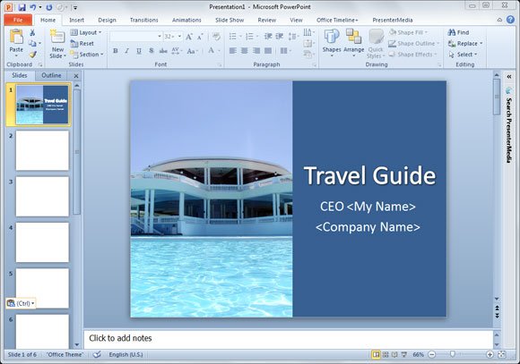
If you use images, you can split the slide in different sections, for example use a vertical layout where you can display a high quality picture on the left and the presentation title on the right.

This example shows a good PPT slide where the presentation title is?accompanied?with a nice HD photo for a travel guide presentation. Notice that the title is in the middle of the slide instead of the bottom part. This is also important since if you put the title too low and you are presenting in a big auditorium, the people in front will hide this title for the people who is behind.
?
?
Related posts:
- Creating a Presentation for Hotel or Travel Agency
Source: http://www.free-power-point-templates.com/articles/presentation-title-in-powerpoint/
brady quinn bloom box fat tuesday obama sweet home chicago accenture match play george washington carver king cake
No comments:
Post a Comment
Note: Only a member of this blog may post a comment.